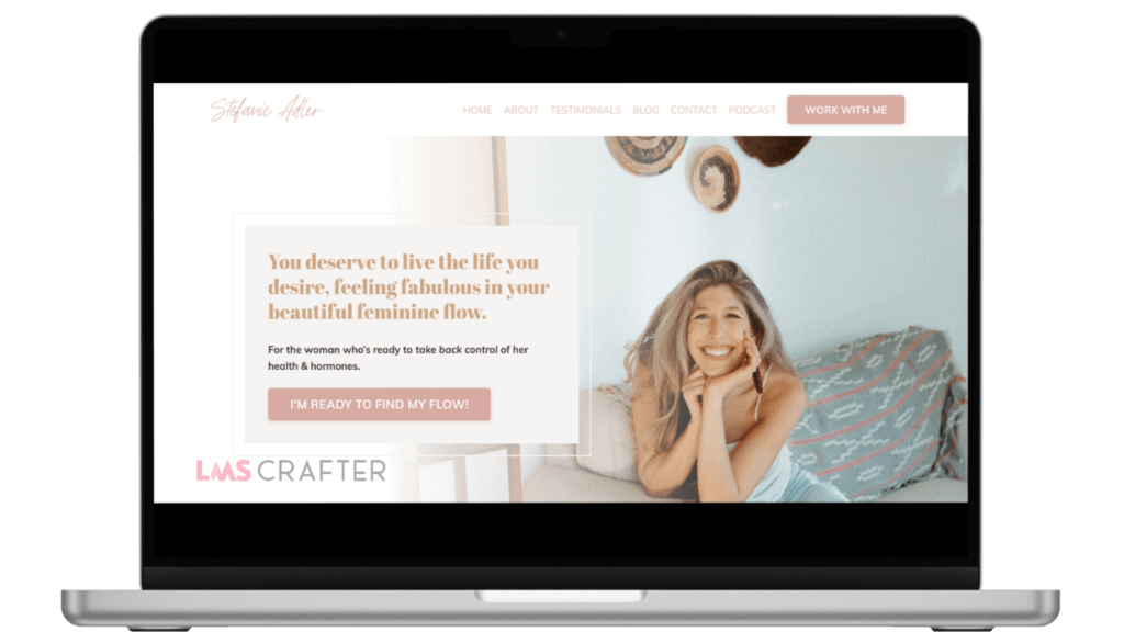
Stefanie Adler
Project Overview
- Client: Stefanie Adler, a certified functional nutritionist and wellness expert.
- Project Type: Kajabi website development.
- Objective: To create a visually appealing, user-friendly, and functional Kajabi website that showcases Stefanie’s expertise in nutrition and wellness while providing a seamless user experience for clients to access her services, programs, and resources.

Client Goals
- Establish a strong online presence to reflect her brand and attract potential clients.
- Create a platform for selling courses, programs, and other digital products.
- Streamline client onboarding and resource delivery through an integrated Kajabi platform.
- Ensure the website is optimized for conversions, encouraging visitors to sign up for programs or book consultations.
Design & Development Approach
- Branding and Aesthetics: Ensured the design reflects Stefanie’s brand identity, focusing on wellness, holistic health, and feminine energy. Used a calming color palette, clean typography, and high-quality imagery.
- User Experience (UX): Designed a clear and intuitive navigation structure, making it easy for visitors to find information about Stefanie’s services, programs, and resources. Included prominent call-to-action buttons to drive conversions.
- Content Strategy: Structured the content to highlight Stefanie’s expertise, including detailed service descriptions, testimonials, and an engaging blog section. Focused on SEO optimization to improve organic search visibility.
- Course & Program Integration: Integrated Stefanie’s online courses and programs into the Kajabi platform, ensuring smooth access for users. Set up automated email sequences and funnels to enhance client engagement and retention.
- Responsive Design: Ensured the website is fully responsive, providing a seamless experience across all devices, including mobile phones and tablets.
Challenges & Solutions
- Challenge: Integrating Stefanie’s diverse range of services and resources into a cohesive platform that is both visually appealing and easy to navigate.
- Solution: Created a well-organized site structure with dedicated sections for each service, ensuring that visitors can easily find and access the content they are looking for.
Results & Impact
- Increased Engagement: The website’s user-friendly design and clear calls to action resulted in increased user engagement, with more visitors exploring Stefanie’s programs and booking consultations.
- Higher Conversion Rates: Optimized the site for conversions, leading to a significant increase in sign-ups for Stefanie’s programs and courses.
- Positive Feedback: Received positive feedback from Stefanie and her clients, who praised the website’s aesthetic appeal and ease of use.
- Enhanced Brand Presence: The new website successfully reinforced Stefanie’s brand identity, establishing her as a trusted authority in the nutrition and wellness space.


